


Whole books have been written on the psychology of color. Some colors sooth us while
others excite us and having a basic knowledge of this prevents one from painting his
bedroom fire engine red or the baby’s playroom grey. But the picture is so much bigger.
Proportion, scale, traffic patterns, arrangement, use, mood… all of these and more MUST
be considered before decisions are made on how to construct and furnish a house.
No one element stands alone… each decision builds on and impacts the others.
I am often asked, “What is your first step?”
For me it is usually a fabric, a rug, or a piece of art.
This becomes the starting point for the color palette for the rest of the house.
I usually work in threes where color is concerned whether dealing with a monochromatic scheme or a more… well… colorful one.
One color becomes the primary focus of the room with the other two serving a backup role. The roles change from room to room as do the values, tints and shades but the hues (colors) remain the same for a unified feel to the house.
For instance, in this room I see black, white and sepia.

This one is pink, beige and orange

But it’s not just any pink, beige and orange. The vital element in choosing colors that work is understanding their undertones. When I was in school we used to have to paint our own color charts to help us understand this.
If you study colors long enough you will soon be able to see that they all fit in families. One family will have a yellow undertone, one a blue, one a grey etc.
Then within these families each color moves progressively along a line toward black or toward white. I call them muddy or clear.
You can see this illustrated on the three color wheels.

For colors to work together they need to chosen from the same position along the wheel or from the same “band” or “ring”. If you get this positioning right the color combinations will be pleasing.
Maria Killam of Color Me Happy refers to this as clean color vs dirty color and that’s a good way to think of it.
She recently used a great picture that illustrates this concept.
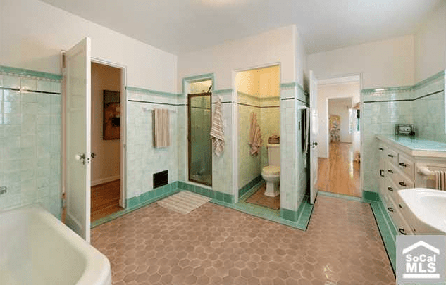
Do you cringe when you see this space? Examine it. The floor is a muddy/dirty color with a pink undertone while the wall is a clear/clean color.
They will NEVER work together.
How, then, does one get it right!
When selecting a paint color you have to first compare it to white to make sure you are in the family you want to be in but then you always have to cross compare it to colors within its own family to see where you fall along the spectrum. Meaning, if you are choosing a green compare it to a half dozen other greens to make sure you are seeing what you think you are seeing. Then after you narrow that down pair it with the other hues you plan to use and if you still like it you are good to go!!
In the following example you will see how one hue ( the lavender) looks totally different depending on what it is paired with.

When placed on the blue it takes on a red undertone .
When used with purple it becomes blue.
Which do you want?
I am beginning to feel you glazing over so I will stop here.
If you have specific color questions please feel free to ask them in the comment area and we will go into as much detail as you want.
If you would like to say, “That was fun!” at the end of your project contact me at

ricci
Great post. I think a lot of clients don’t really understand how colors can appear completely different when they are paired with or appear next to another color…..Your example helped to make this concept clear
Liz
Great explanation.